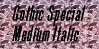
A revival of one of the popular wooden type fonts of the 19th century, suitable for text or display, short descenders, tall ascenders, the narrow, italic version, completing the family of 6 fonts in total, sans serif.
A revival of one of the popular wooden type fonts of the 19th century, suitable for text or display, short descenders, tall ascenders, the narrow, italic version, completing the family of 6 fonts in total, sans serif.

A revival of one of the popular wooden type fonts of the 19th century, suitable for text or display, short descenders, tall ascenders, the narrow, italic version, completing the Gothic Special family of 5 fonts in total, sans serif.

Based on a revival of one of the popular type fonts of the 19th century, suitable for display, or text.
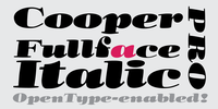
This typeface is the definitive version of Oswald Bruce Cooper’s lost typeface Cooper Fullface Italic. More…
The Barnhart Brothers & Spindler foundry, for whom Cooper had designed a number of typefaces, saw the potential of the typeface as a big seller. Richard McArther, General Manager of the foundry, referred to it as “the hotsy stuff”, though he was highly critical of a number of characters in the original design.
He requested a successive number of modifications, including the addition of Dwiggins-inspired serifs to the face to make it stand apart from similarly-weighted typefaces then on the market.
He wanted to imbue the face with a considerable amount of "old-timey" flavor in order to impart a sense of originality to the face and have it sell across both Modern and Bodoni/Didot market segments.
The final form of the face was a regulated and consistent balance of cartoonishness and earnest visual braggadocio, the bouncy, circus fairway-like swing of the original drawings of the letters taken down considerably and figures redrawn and redrawn for maximum readability.
The American Type Founders continued to produce the face and sell it at a decent pace, renaming it Cooper Modern.
The BB&S foundry closure resulted in the foundry equipment being shipped to New Jersey a few weeks shy of the typeface’s completion. It is unfortunate, as the accompanying italic is perhaps Cooper’s masterpiece, a lively Bodoni-esque italic with more than a bit of influence from 19th Century display types, particularly in the treatment of the ball serifs on the uppercase “A”, “J”, “M”, and “N”.
Cooper Fullface Italic stands as the until-now missing bookend to Cooper’s career as a type designer.
Within is a typeface that spans the range of Cooper’s original drawings, utilizing a number of alternate characters.
The typeface includes the original ligatures, original Oz Cooper ornaments, fancy swash characters, and a range of punctuation and diacritics, et al, that fill out a full character set. The typefaces have been lovingly kerned for the smoothest result in text setting.
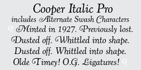
This typeface is the definitive version of Oswald Bruce Cooper’s classic typeface Cooper Italic.
1924 saw the release of Cooper Italic, the italic companion to Cooper Oldstyle. Cooper Italic possesses “a most unusual swing” in a number of the characters, most specifically the scooped, pigeon-toed feet of the lowercase “n”, “h”, and “m”.
These idiosyncratic characters are offset by more stately and assured capitals. Cooper said that his Italic is “much closer to its parent pen form than the roman” and “that freedom is almost the life of it”.
More…
In Cooper’s own words about Cooper Italic, "The designer is conscious of its crudity, and of its irreverence for the best traditions. But he believes that there are enough good types already– that the need is for poor types that can be used! And since he admits this to be a poor one, there now remains to be found out only whether it is usable or not." Cooper was long a believer that good type should be homely- if too pretty or sleek, it’s lifespan would be exponentially shortened.
The swash capitals are a lively interpretation of round serifed oldstyle caps mixed with classic Caslon italic forms.
The typefaces include the original ligatures (never before released digitally), the previously unreleased Swash characters, small caps and a range of punctuation and diacritics, et al, that fill out a full character set.
The typefaces have been lovingly kerned for the smoothest result in text setting.

Accord Alternate Italic is designed at an italic angle of 10 degree. All the letter forms have been kept similar while designing italic instead changing the form e.g. ‘a’ remains same double storey in italic also instead changing it to single storey.
The intention is to keep it simple and neutral which helps communicate the corporate sense of professionalism.
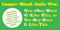
Cooper Black Italic Pro is a digital interpretation of Oz Cooper’s original Cooper Black Italic that features OpenType swash caps as alternate glyphs alongside the full upper and lower case character set.
Just as Cooper Black Italic were originally founded with the swash capitals as separate alternate characters, the swash capitals are included in the font as additional glyphs. Included are swash capitals for I, K, L, W, and X, not included in Cooper’s original design.
More…
Cooper Black Italic Pro’s characters are drawn from Oz Cooper’s original drawings and do not feature the odd curves that most digital versions of the typeface have.
