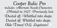
This typeface is the definitive version of Oswald Bruce Cooper’s classic typeface Cooper Italic.
1924 saw the release of Cooper Italic, the italic companion to Cooper Oldstyle. Cooper Italic possesses “a most unusual swing” in a number of the characters, most specifically the scooped, pigeon-toed feet of the lowercase “n”, “h”, and “m”.
These idiosyncratic characters are offset by more stately and assured capitals. Cooper said that his Italic is “much closer to its parent pen form than the roman” and “that freedom is almost the life of it”.
More…
In Cooper’s own words about Cooper Italic, "The designer is conscious of its crudity, and of its irreverence for the best traditions. But he believes that there are enough good types already– that the need is for poor types that can be used! And since he admits this to be a poor one, there now remains to be found out only whether it is usable or not." Cooper was long a believer that good type should be homely- if too pretty or sleek, it’s lifespan would be exponentially shortened.
The swash capitals are a lively interpretation of round serifed oldstyle caps mixed with classic Caslon italic forms.
The typefaces include the original ligatures (never before released digitally), the previously unreleased Swash characters, small caps and a range of punctuation and diacritics, et al, that fill out a full character set.
The typefaces have been lovingly kerned for the smoothest result in text setting.
No comments:
Post a Comment