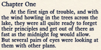
Darnalls is a slightly badly-printed style of old-fashioned-book typeface. There is the standard version which has a little print noise (quite subtly in the Regular version, more noticeably in the Bold version); and a clean version which has virtually no noise or bits, just the slightly misprinted letters and numbers and so on.
These 2 varieties both have the 4 standard versions of Regular, Bold, and their 2 italic counterparts. More…
(You can see, for example, in the small square flag accompanying this font that the two a’s and l’s in Darnalls are somewhat different, and the 3 n’s in the picture for the author Fickan Finn are all different).
These are all activated by turning ligatures on in any OT-ready software (some programs enable it by default). You can also type some of these examples into the text-box on this webpage to see it, with ligatures set to on.
And there’s lots of other OT features like historical forms, subscript and so on, giving plenty of variety to the characters. There’s a little more info in the zip file.
No comments:
Post a Comment