
The Vtg Stencil series of fonts from astype are based on real world stencils.
Have a look at the Vtg Stencil Ornaments A.
The Vtg Stencil series of fonts from astype are based on real world stencils.
Have a look at the Vtg Stencil Ornaments A.

Vtg Stencil Ornaments are designed to work with all the US stencil fonts from astype. Have a look at Vtg Stencil US No.2, No.51 and No.72.

Equalis Stencil is a slab-serif typeface. This OpenType font comes in three weights, alternates and symbols, with support for CE languages.
Equalis Stencil can be used as display type, headlines, packaging, signs routing and a wide range of projects.
family of 2 fonts from Jeff Levine
Sloppy Stencil JNL is a distressed stencil typeface similar to Packed JNL.
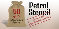
Petrol Stencil is a new creation of Naghi Naghashian. Petrol Stencil is designed for technical use. it is the first Arabic Stencil typeface known until today for stamping on packing crate, sacks and vehicles.
This typeface offers a fine balance between calligraphic tradition and the sans serif aesthetic common in Latin typography.
Petrol Stencil supports Arabic, Persian, and Urdu.
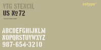
The Vtg Stencil series of fonts from astype are based on real world stencils.
All styles offering an extended Latin character set.

Probably one of the most unusual applications of a stencil took place in 1964 when Union Carbide [then-owner of the still-new line of “Glad” brand plastic wrap and storage bags] sponsored a $100,000 contest to match up a stencil of their logo in order to win a prize.
The magazine ad told of how one thousand lucky participants would win $100 by simply taking a die-cut stencil of the brand name to the store and overlaying it on the logo printed on the food wrap box to see if it aligned perfectly.
More…
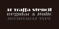
AT Traffa is a stencil, display face with extended latin & cyrillic support.
Simple but optically corrected shapes with playful lowercase give this design a very distinctive feel.
Comes with an interesting italic version.
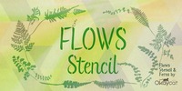
Okaycat JAPAN proudly presents “Flows Stencil”. Flows Stencil is a gentle script with beautiful illustrated look.
Flows Stencil matches well with Okaycat font, Flows. Flows Stencil is a multilingual font appropriate for publishing and international design environments.
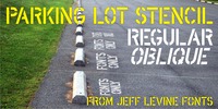
At first glance Parking Lot Stencil JNL look quite similar to many sans stencil fonts, but rest assured there are numerous subtle nuances that give the typeface its own unique flavor.
Modeled after the plastic stencils used for marking numbers and directional information on paved surfaces, the lettering is clean yet industrial.
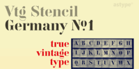
The Vtg Stencil series of fonts from astype are based on real world stencils. The Germany No.1 design was derived from authentic antique German stencil-plates.
Surprisingly these stencil-plates offer a high contrast Didot design very similar to the French stencils produced and sold till today.
The production time of these stencils is in the range of the German imperial period (1871‒1918). Of course the usage period was even longer. More…
An extensive random function will mix the glyphs as you type - on proper OpenType-savvy apps like Adobe InDesign only.
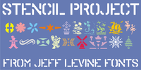
Stencil Project JNL combines a number of themes within the many decorative stencil designs re-drawn from vintage sources.

A brass stencil hand cut to mark the tops of oil drums yielded the lettering for Stencil Plate JNL. The font emulates the retro feel of the unique letter forms found in the original antique design.

The type design which inspired Stencil Maker JNL comes from a 1920s-era machine used in movie theaters of the day. It rendered tiny punched out letters (some characters solid and some in stencil form), enabling the user to make projection slides of important messages or general notices for the theater audience to read.

Stencil Sheet JNL was modeled from an antique brass stencil sign that was custom hand punched for the customer. Sets of punch dies were available for years that allowed rubber stamp shops and similar trades to make custom stencils out of sheets of zinc or brass.
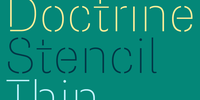
A utilitarian display typeface with a muscular character, Doctrine Stencil is the revolutionary comrade of the text typeface Doctrine. From the obscure starting point of the North Korean national airline livery, Doctrine Stencil has grown to encompass a series of more mature typographic influences.
By blending elements of twentieth-century neo-grotesque, humanist and geometric styles, Doctrine Stencil is at once universal and idiosyncratic. Doctrine Stencil is informed mid-twentieth-century modernism, yet is more human and less clinical than many modernist faces.
The rounded, lighter weights speak with graceful composure whilst the large x-height, low contrast and squarer, heavier weights give Doctrine Stencil an affable charm and a persuasive voice.
More…
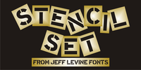
Stencil Set JNL takes the 2011 release of Stencil Mark JNL (a spur-serif letter based on a vintage set of brass stencils) and transitions it to the design of a clean, bold sans typeface.

Mic 32 New Stencil is the third variation of the popular Moretype family Mic 32 New.
This stencil version provides an industrial flavour to the futuristic rounded geometry of Mic 32 New.
Mic 32 New Stencil still has all the normal Opentype features including small caps, tabular, proportional and old style numerals and ligatures.


