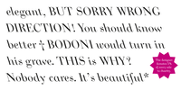
The story of Bodoni Ritalic began in 2006. It was a favour for a friend and my starting point dealing with serifed faces. There is one feature which make this type remarkable. It is its reversed tilting angle to the left.
The idea was compelling although there were predecessors, mainly used in cartography. Bodoni faces are a challenge, because of their formal accomplishment. In 2006 my type design capabilities were advancing, but not to the point of reaching a fine and well articulated Bodoni interpretations cut by Heinrich Jost for the Bauersche Gieflerei (German foundry).
So I revised this type completely, with the “Manuale tipografico” of Bodoni as guideline. I learned a lot from the bigger font sizes, therefore I conceptualised Bodoni Ritalic for display purposes above 18pt.
Bodoni would have liked this type?
No comments:
Post a Comment