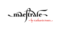
Maestrale is a paradigm-breaking new take on calligraphy, built around a compact, serif-style core and outrageously long, flamboyant extenders. At large sizes, its confident, charismatic lettershapes are ideally suited for branding and decorative uses, whereas longer texts at smaller sizes naturally weave themselves into a flowing texture.
The font comprises 1299 glyphs, including many stylistic alternates, ligatures, small capitals, and initial, terminal, and linking forms, and offers extensive OpenType programming to support them.
The calligraphic form of Maestrale is complemented by a matching text font (Maestrale Text) with short extenders, available in three cuts (a serif-style Roman, an upright Cursive, and a tilted Italic).
More…
Maestrale is all about the lowercase; its capitals are deliberately understated so as not to steal the limelight. In fact, the font works very well when set exclusively in lowercase.
Maestrale’s small capitals are fitted into the core space of the lowercase, allowing them to be freely interspersed with lowercase characters. Alternately, an OpenType feature is available to replace a and e in small-caps text with their lowercase equivalents for a fresh unicase look.
Since alternates and ligatures play such an important role, Maestrale offers three different modes of use.
The most straightforward approach is simply to start typing using Maestrale Pro — the extensive OpenType programming will ensure that collisions between extenders are avoided and attractive ligatures are substituted for common glyph combinations.
A more interactive approach is provided by the font Maestrale Manual, which allows the user to manually select alternate forms and ligatures even in typographically unsavvy applications, such as PowerPoint (as long as standard ligatures are supported).
Stylistic alternates are simply represented as ligatures of their base forms with one or more instances of the rarely-used by easily-accessed characters "~" (ASCII tilde) and "`" (spacing grave accent); linking forms are built with “_” (underscore), multi-character ligatures with "|" (pipe), and initial and terminal forms with the “less than” and “greater than” characters.
For instance, the Maestrale wordmark in the posters above was simply typeset with the string (`ma`est|r_a```l```e)| in Maestrale Manual (The parentheses represent “less than” and “greater than” characters here.) Feel free to type this string into the test line below and see what happens! Make sure Standard Ligatures are enabled.
An instruction sheet listing all alternate forms and their accessibility will shortly be uploaded to the Gallery.
The third mode of usage is aimed at professional designers, who make use of sophisticated software with extensive OpenType support.
These power users are advised to use the font Maestrale Pro again, where all glyphs are accessible as stylistic alternates.
Maestrale Text is a less extravagant but more versatile variation on the design of Maestrale, replacing Maestrale’s swashes with efficiently compact extenders.
It is intended to serve as a perfectly matching text companion to Maestrale calligraphy, but constitutes a full-fledged typeface in its own right. It is equally at home at display sizes as it is in pull quotes, titles, and high-impact blocks of text.
Maestrale Text comes in three complementary faces: A serif-style Roman, an upright Cursive, and a tilted Italic.
Maestrale is the Italian word for “masterful”.
It is also the traditional Italian name for the northwesterly mediterranean wind, better known by its French name, Mistral.
Acknowledgements: I am grateful to the helpful souls on the Typophile forums for extensive feedback and encouragement on Maestrale, and to the TypeDrawers forum for feedback on Maestrale Text.
This font is dedicated to Simone.
read more