Download DSari Font Family Style
Download DSari Font Style Family

DSari is a Neohumanist typeface but not traditional, includes 22 weights, ideal for magazines, logos, motion graphic and posters.
DSari is a Neohumanist typeface but not traditional, includes 22 weights, ideal for magazines, logos, motion graphic and posters.

Chunkfeeder was inspired by the many vernacular forms of lettering created for high speed printing and electronic displays found in our modern techie world such as postal packing slips, airline tickets and informational video displays. Many of these type of fonts are designed by engineers and interface designers who presumably do not have a background in letterform design and consequently these glyphs have many quirky idiosyncrasies.
In keeping with it’s mechanical inspiration, Chunkfeeder is a monospaced font, much like an OCR type font. Chunkfeeder has a rather ridged modularity but it incorporates more typographic nuance into the letterforms than most other fonts of this style, while exploiting some of the visual artefacts of high speed printing. More…

Wood Body w/ Electric Heart & Synthetic Mind...
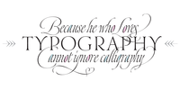
One of my dreams as a type-designer was making a good looking chancery cursive. Full of life, like some of the best calligraphers around the world do on their artworks.
With Julian Waters, John Stevens and Denis Brown (just to name a few of them) (1) chancery, or italic script, was transformed into a new, exciting and very fresh style of calligraphy mainly at the end of 20th Century.
More…
Making a font out of my ink-sketches was a tough work, since they were closer of -being art- than of -being type-. However, this font rescues many aspects of handmade calligraphy: You have to look at it really close to notice it is actually a font, and that was one of my goals.
The secret of a good looking chancery is on its subtle details: pen angle is constantly changing, even on the strokes which seem straight. Capitals and swashes have to be done a little faster than lowercase letters.
The rhythm has to be even, in spite of its playful look.
The fact that makes Dream look alive is that it has many alternates per glyph. This makes each word look unique like it happens in calligraphy: you will find alternates for the beginning/ending of a word/phrase, some for the middle of it, some interchangeable.
Also, to accompany the script, you will find Dream Caps, which was inspired in the eternally beautiful trajan capitals. Place them like I did on the posters and you will have great results for sure.
Dream Script Standard has less glyphs than the Pro one, it contains just some ligatures for a better legibility. (OT programmed, better if you use Adobe applications)
I would also like to thank Ricardo Rousselot, whose work inspired me this time to make “The Dream Script” exlibris; and to Alisara Tareekes, a very talented friend which international calligraphy conferences gave me: She kindly helped me with some tips to make this font better.

Doughboy is a juicy collection of bubbles inspired by cookies and the way they flatten out when baked. Imagine a sheet of cookie dough cut into a quirky set of san-serif letters, then baked! The result is bubblicious! Pack it tight in large display settings and infuse it with delicious pallets of high contrast color.
Originally designed by Lucas Sharp in 2008 and completed by Lucas and Greg Gazdowicz in 2013.
See the official web specimen here.

Dorum FY is a black modular stencil display font with very rounded elements. It includes 10 cute & funny dingbats. Dorum FY will certainly show the best of its face at large sizes the bigger, the better.
